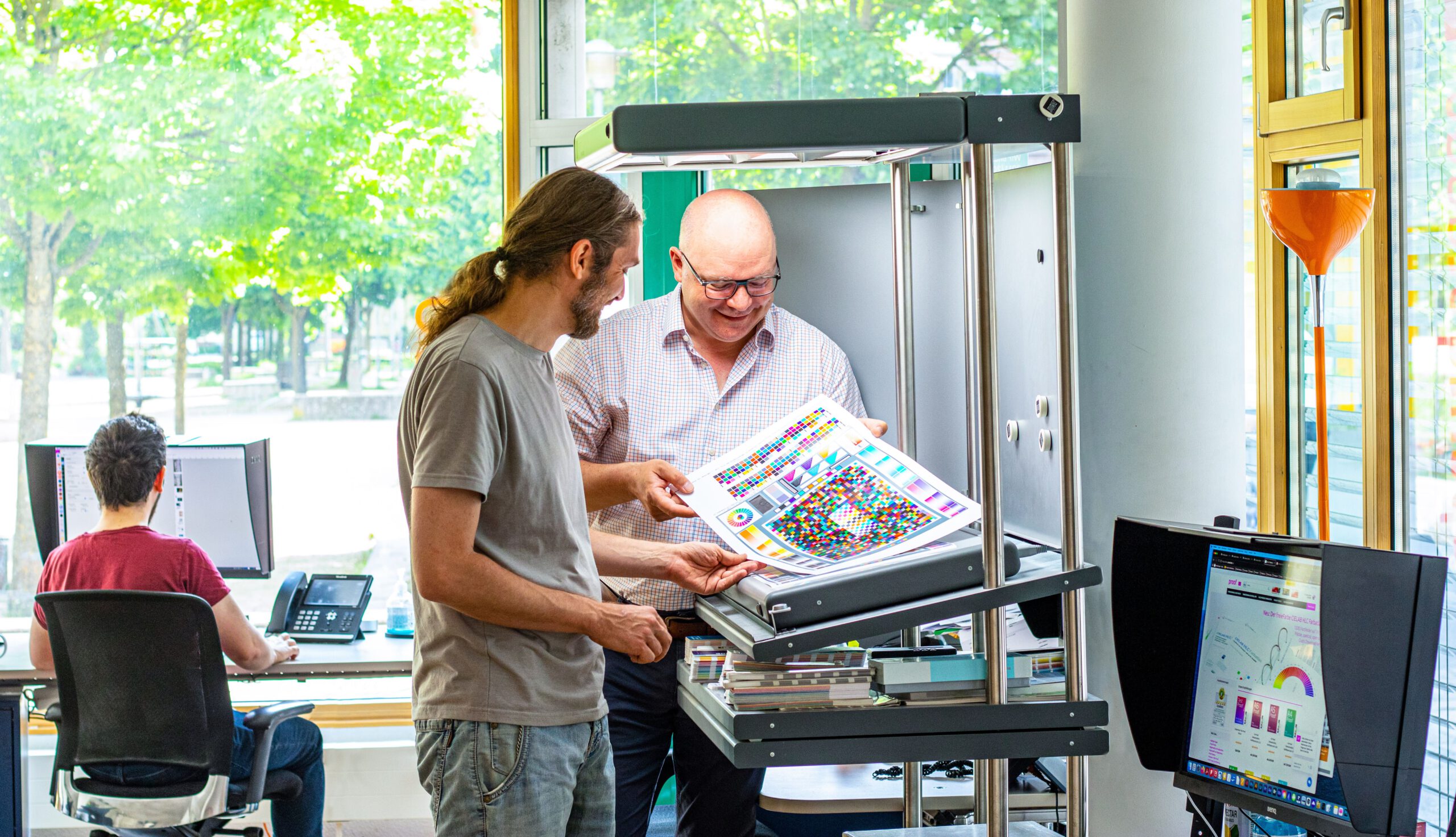


Recently, we have been receiving more and more colour management consulting enquiries where “digital first” designs reach their limits: Namely, always when, after a few months or years, the first trade fair appearance, the first annual report or the first catalogue in classic online printing is due. And it is precisely at this moment that it occurs to everyone involved that they do not even know how their “digital first” colour strategy is supposed to look in print. But let’s take a look at the problem from the beginning:
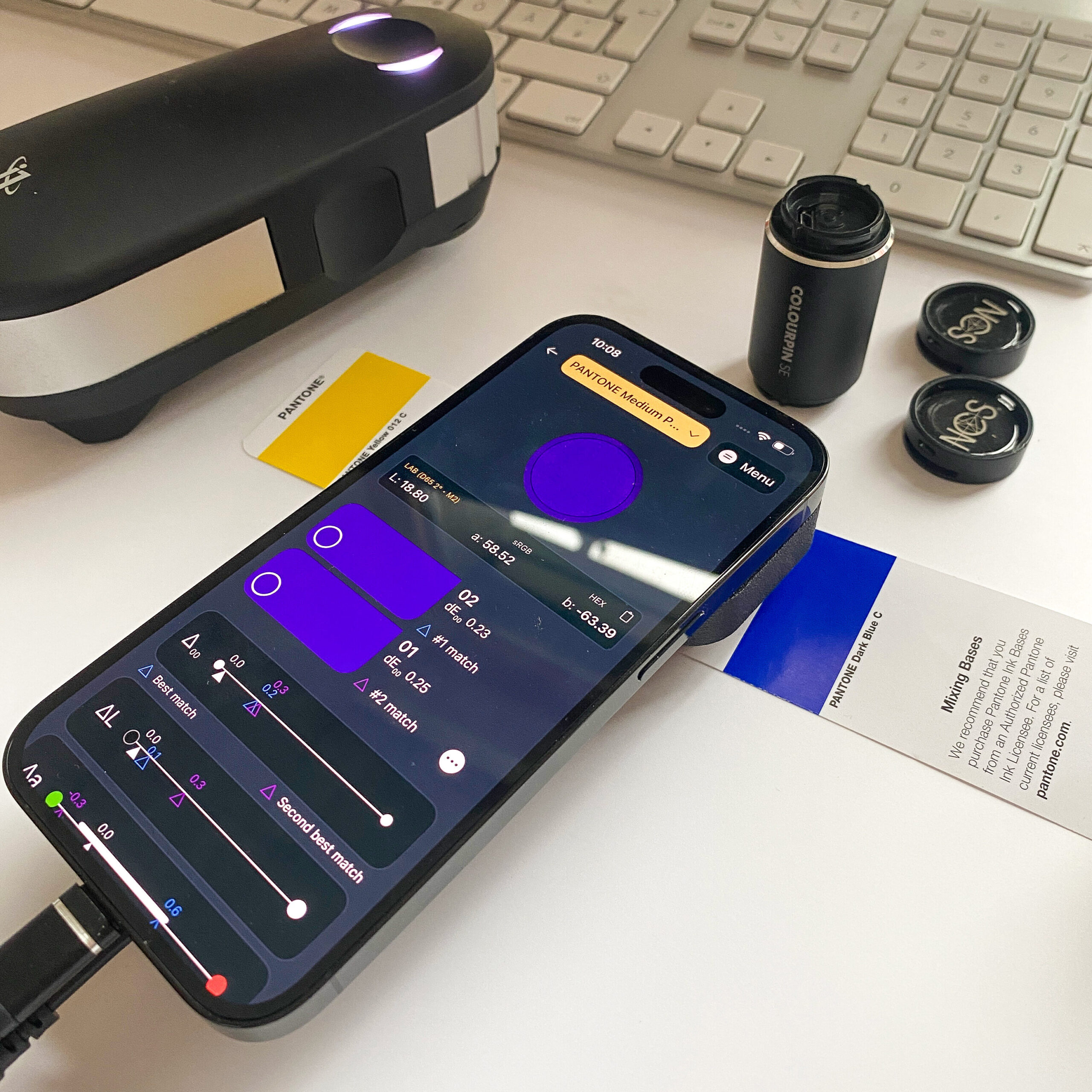
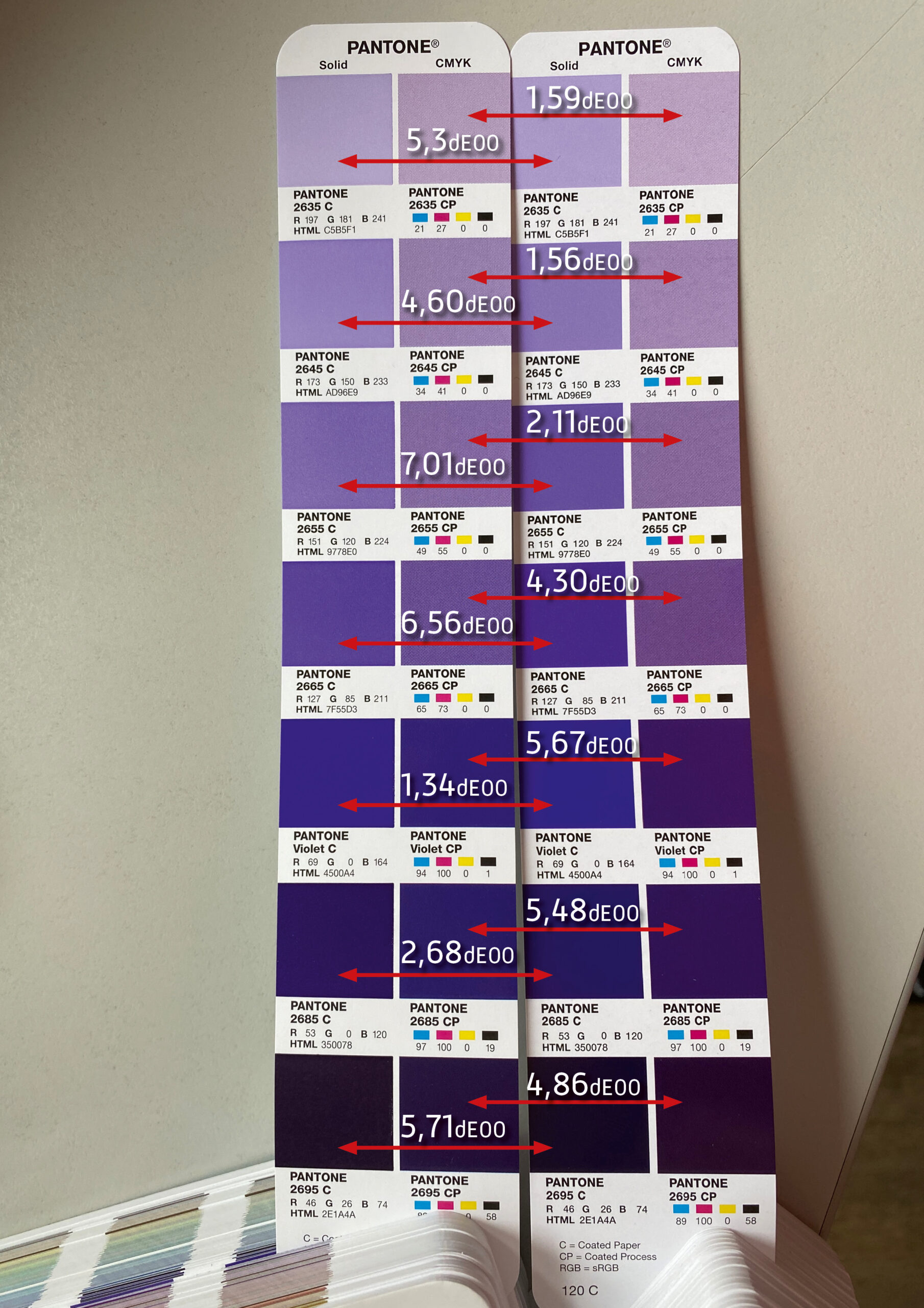
Precise proofing of tonal values of spot colours
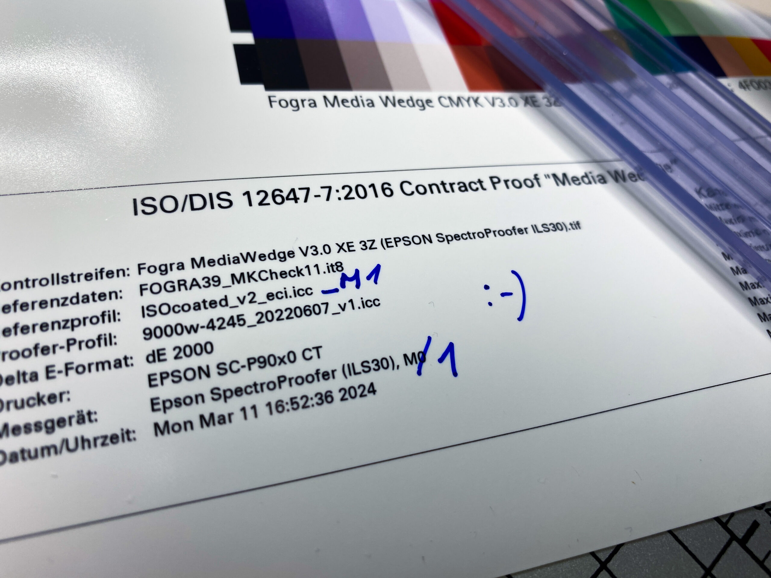
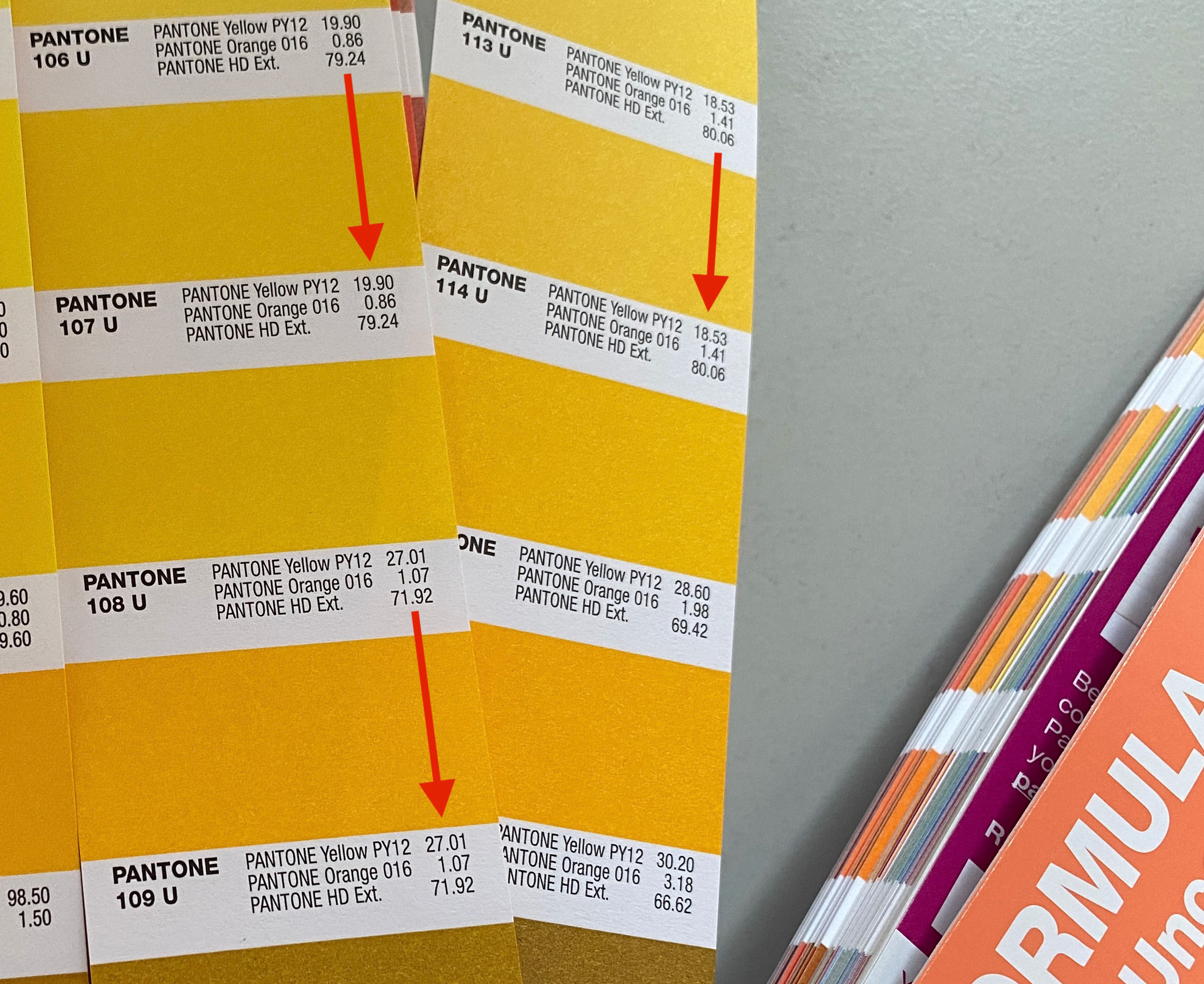
In recent weeks, there have been lengthy discussions on the Fogra digital printing mailing list as to whether a research project should be launched to define standardised tonal value gradations for spot colours. What is this all about? In the field of CMYK and seven-colour printing, the definition of clear, printable and proofable standards is well established and has been tried and tested in practice. If the paper or paper class is known and defined, a measuring standard such as M0/M1/M2 has been established and the content of optical brighteners …